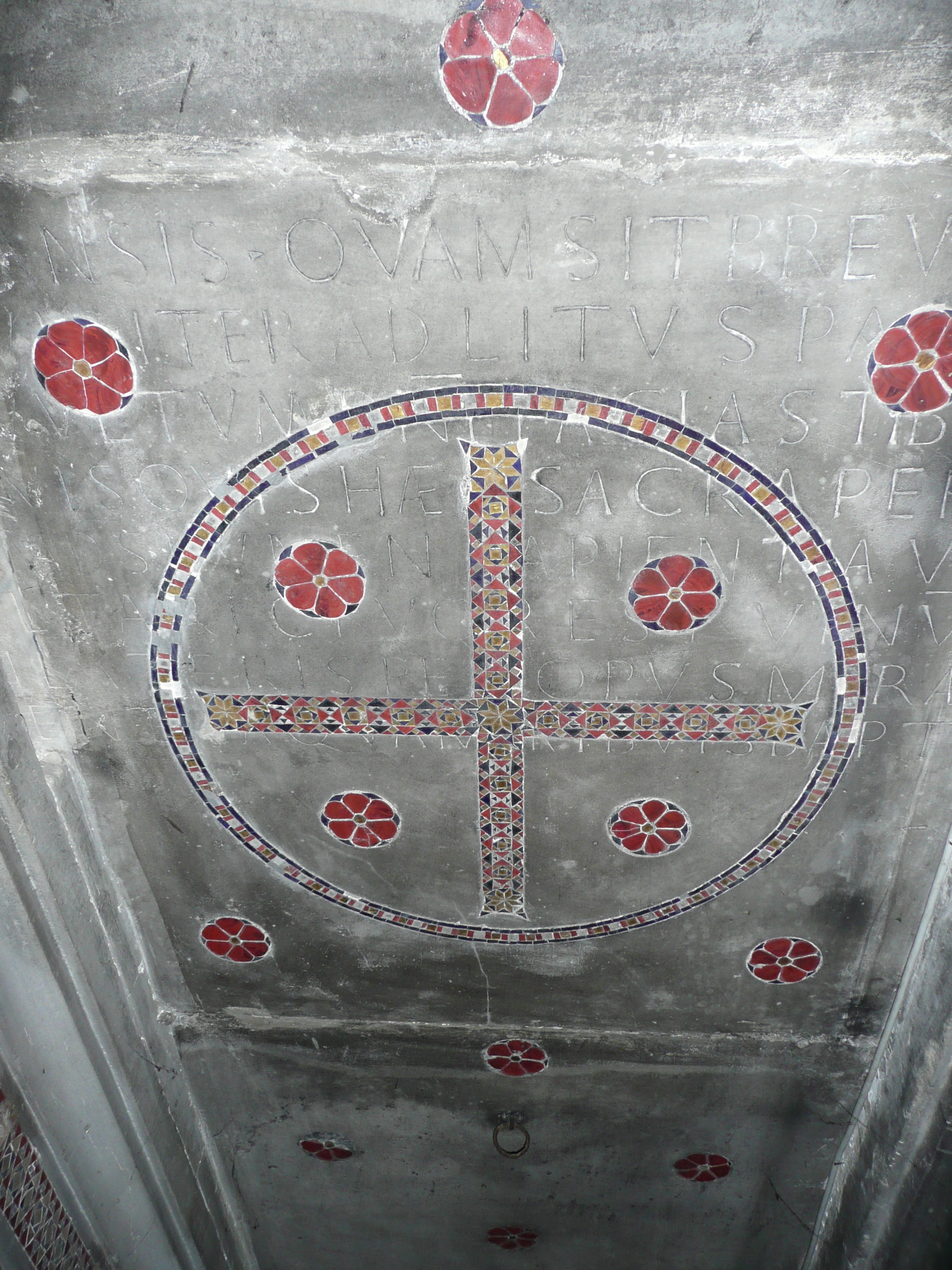
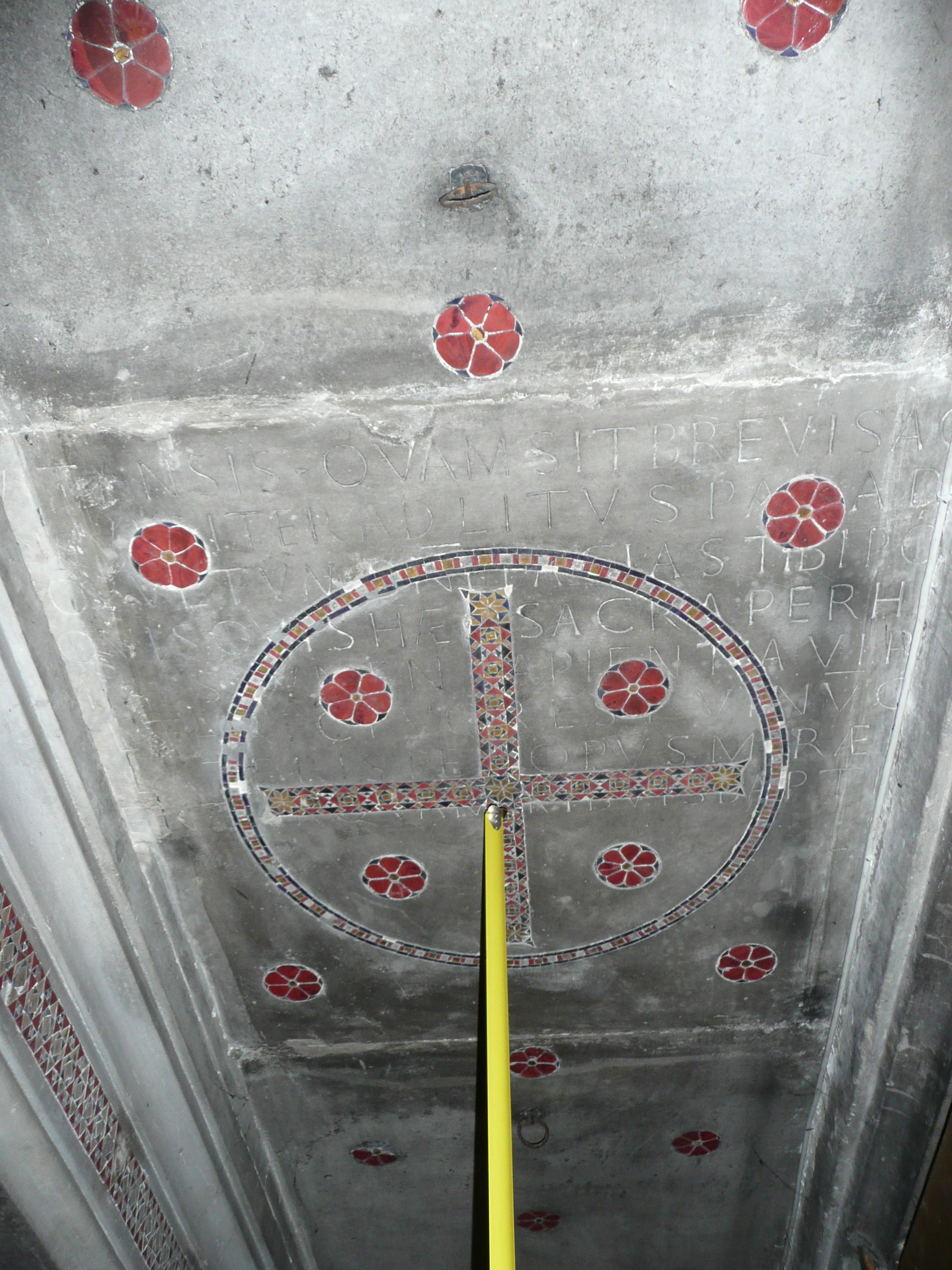
Let’s start with what I could actually see when I looked up at the slab. Here are a couple of snapshots I took while Professor Bianchi’s crew were setting up to take far better quality pictures. (For those keeping score at home, I’ll remind you that the date was Skylab Day, 11 July 2007.)


The slab of stone that has been set overhead has also been cut and inset with colored stone in a style and method known as Cosmatesque. There are several little floral decorations on this and the neighboring slabs, and this slab has also been inset with a large circle around an equilateral cross (like the cruciform halos seen in Christian art). The inset patterns have damaged an inscription. There are eight lines of Latin in the inscription, the last of which is partially covered by the horizontal bar of the cross. Whoever decorated the stone and set it in it’s current position (assuming that these actions were done at about the same time) apparently did not care about the earlier inscription.
In the inscription, the letters that I can actually read (in whole or in part) on the stone in our snapshots are these:
1 - ]VITRANSIS•QVAMSITBREVISAC[
2 - ]AVISITERADLITVSPARAD[
3 - ]OVVLTVMDN̅I̅FACIASTIBIPO[
4 - ]QVISQVISHÆCSACRAPERH[
5 - ]MMAD̅S̅LVMEN[ ]APIENTIAVIR[
6 - ]ALTARICRVORESTVINV̅Q[
7 - ]ILATERISPE[ ]OPVSMIRÆ[
8 - ]ENTERAQVAM[ ]RIBVISBAPTI[
The square brackets that I’m using are a standard notation. They indicate that the text I’m giving you does not end naturally, that there are other letters in the original that I can’t physically see. In papyrology, the square brackets normally signal damage to the papyrus itself (e.g., a torn edge or a hole in the middle). Here, they indicate two things: the first, places where none of a letter can be seen at all because of the mosaic pattern inset into the slab; the second, the edges of the stone, where letters are hidden by the walls upon which our slab is now resting.
The right edge of the slab with our inscription is sitting right down on top of supporting stone, and nothing more could be read without damaging stonework. The left edge of the stone is also resting on supporting stonework except where the eight lines of text are; here, a relief has been cut out of the supporting stone, and had I a ladder, a flashlight, and a different angle, I might have been able to read more of the letters. I believe that this must be how the extra letters along the left edge have been read before.
Looking through the stuff Professor Bianchi sent me, I see that his is not the first publication of this inscription. It was originally published more than eighty years ago by a Jesuit scholar.
Original publication:
Felice Grossi-Gondi, “L’iscrizione eucaristica del secolo V nella basilica di S. Lorenzo al Verano,” Nuovo Bullettino di Archeologia Cristiana, 1921, pp. 106-11.
And since that was so long ago, you can now nab a copy of that publication (one page at a time) for free off the interwebs. The six jpegs will cost you about 2.5 Mb of disc space, and the article is in Italian, and if your Italian was any better than mine (which is functionally non-existent), you wouldn’t have complained to me, but here it is anyway:
Original publication.
By the way, while looking for this article, I found it referenced here:
Another publication (which I have not yet seen):
Antonio Ferrua, Inscriptiones Christianae Urbis Romae, vol. VII, 1980, n. 18324, pp. 164-165.
Fr. Grossi-Gondi recognized that the six lines of Latin start with a standard sentiment for an ancient epitaph. On headstones one will often read things like, “You who pass by and read this, have a kind thought for the poor sod beneath this sod. What you are, I once was; what I am, you will be.” We have something similar here. He also recognized that the Latin is in meter, and not in the usual (for headstones) elegiac couplets, but in the grander epic meter, dactylic hexameter (the form used by Homer and Vergil). So it’s not just an inscription, but a poem, and a poem that evokes epic rather than little ditties.
On p. 106, the first page of his article, he supplements the text that he can actually read with letters that he thinks are likely to be the correct ones. He has the advantage of knowing that whatever he puts at the beginning and end of each line has to fit the poetry; that is, his supplements have to scan properly. Here’s his solution:
1 - adsp]ICE QVI TRANSIS • QVAM SIT BREVIS AC[ipe vita
2 - atqu]E TVÆ NAVIS ITER AD LITVS PARAD[isi
3 - rell]EGE • QVO VVLTVM DN̅I̅ FACIAS TIBI PO[rtum
4 - percipias gra]T IAM QVIS QVIS HÆC SACRA PERH[aurias
5 - glor]IA SVMMA D̅S̅ LVMEN SAPIENTIA VIR[tus
6 - ver]VS IN ALTARI CRVOR EST VINV̅Q [videtur
7 - is]Q TVI LATERIS PER OPVS MIRAE [pietatis
8 - unde]POTENTER AQVAM tRIBVIS BAPTI[smate lotis
(For those who can scan Latin poetry, yes there are some minor irregularities. For instance, the second syllable of navis in line two has been lengthened.
If you go to the link for his article, you’ll see, too, that he’s managed to get the page typeset so that the letters on the page line up more or less the way they are on the stone. You’ll also see that his supplement at the beginning of line four sticks way out in front, that it starts farther to the left than his other lines do. This seems a bit unreasonable.
 And it’s one of the places that Professor Bianchi has printed a different solution. (Since I haven’t seen Ferrua’s 1980 publication (no JSTOR access in my life right now), I don’t know how much of this is his work and how much Bianchi’s; I’ll refer to the later variants as Bianchi’s for the sake of simplicity, but in any sort of scholarly discussion, one would want to be more precise.) For line four Grossi-Gondi has:
Percipias gratiam quisquis haec sacra perhaurias.
May you obtain grace, whoever would drink down these sacred things.
For line four, Bianchi has:
Dicat iam quisquis haec sacra perhauriat ore
Whoever would drink down these sacred things, let him now say aloud,
To my mind, this makes a better transition between the first three lines, which are clearly addressed to the reader, and the fifth line, which names the One addressed in the subsequent lines, even if it makes the theology of the inscription less blatant.
Another change printed by Bianchi that improves the reading while muting the theology comes at the beginning of the sixth line. Grossi-Gondi has verus in altari cruor est / true blood is on the altar. Bianchi has cuius in altari cruor est / whose blood is on the altar. Either way, the line is still transubstantiationist. ___ blood is on the altar and seems to be wine.
Allowing that line six could go either way, Bianchi takes a couple of other minor improvements and prints his Latin text (with abbreviations expanded and spelling for the most part regularized)
1 - (Adsp)ICE QUI TRANSIS QUAM SIT BREVIS AC(cipe vita)
2 - (Atqu)E TUAE NAVIS ITER AD LITUS PARAD(isi)
3 - (Der)EGE QUO VULTUM DOMINI FACIAS TIBI PO(rtum)
4 - (Dica)T IAM QUISQUIS HAEC SACRA PERH(auriat ore)
5 - (Glor)IA SUMMA DOMINUS LUMEN SAPIENTIA VIR(tus)
6 - (Cui)US [o: (Ver)US] IN ALTARI CRUOR EST VINUMQUE (videtur)
7 - (Qui)QUE TUI LATERIS PER OPUS MIRAE (pietatis)
8 - (Omni)POTENTER AQUAM TRIBUIS BAPTI(smate lotis)
I’m not sure about the beginning of the third line. Bianchi is accepting a misspelling for dirige, and has supplied an altered vowel to match the one on the stone. He could just as easily have printed (Dir)ege, and I wouldn’t be surprised if an even better solution comes along later. But taking it as Bianchi prints it, I will supply the following pony (a “pony” in this context is a translation meant to explain the literal meaning of a foreign text; it is not meant to be a beautiful exemplar of clear, lucid English, but is meant to convey the sense and the ambiguities of the original):
1. Consider, you who pass by. Accept how brief life is
2. and
3. direct
2. your ship’s journey toward the shore of Paradise
3. to the place where you might make the face of the Lord your harbor.
4. Whoever would drink down these sacred things, let him now say aloud,
5. “Highest Glory, Lord, Light, Wisdom, Virtue,
6. Whose blood is on the altar and appears as wine
7. and You Who,
8. omnipotent, grant to those washed with baptism the water
7. of your side through a work of extraordinary mercy.”
One odd thing about ll. 5-8 is that they are all, grammatically, a direct address. All they are doing is saying good things about the person to whom the words are directed. They are an adoration:
O, Great Glory! (a bit stronger than merely saying, “o, Glorious One.” He is not merely characterized by glory, He is glory).
O, Lord!
O, Light!
O, Wisdom!
O, Virtue!
O, One Whose blood is on the altar in the guise of wine!
and, O, Omnipotent One who (through an act of wondrous mercy) grants the water of Your side to those washed by baptism.
I hope this helps. Feel free to ask for more if you need it.
Izzy
Feast of Corpus Christi, 2008
1 comment:
well, i.m willing to offer any of Jstor articles to anyone, for free. i definitely would like to share user passwords, but these would not work very long, if server is overaccessed with queries form different IP.s but with same user accounts.
so, feel free to mail me the title of article und (or) the Jstor link at
enoeda_shibaru@yahoo.com
and, as soon as possible, I will send you the required texts.
...also Project Muse and EBSCO databases.
PS. the reason for this is i will not pay around 700/1000 us dollars per month to read the stuff.
ps2. ...though it.s not like in Jstor veritas...
Post a Comment